Why did we choose this?
The reason for picking this form of data art is because it represents the difficulties and hardships some people face living in certain areas of East London. Whilst, in other areas the relative crime rate is noticeably area, so the people who live there are at less risk from sex and violent crimes. The contrast between these areas and the visual representation of the crime rate is what appealed to us.
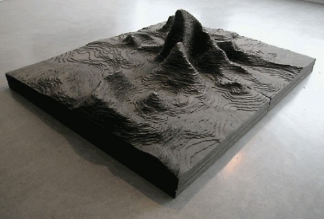
This is part of a series of work from Abigail Reynolds called Mount Fear, each showing the crime rate for different crimes in a range of different cities and areas. Mount Fear South London was a visual representation of the crime rate with offensive weapons in South London. She also made Mount Fear Eindhoven, which displayed the sex crime rate in the area. Mount Fear Manchester interpreted violent crimes in the city.
According to the Trade Gallery text:
“Huge swathes of data, including that used in Mount Fear are deployed within the public domain to shape our perception and fear of crime in everyday life. Mount Fear could be interpreted as a metaphor for an anxious society fixated on numerical justification and accountability.”